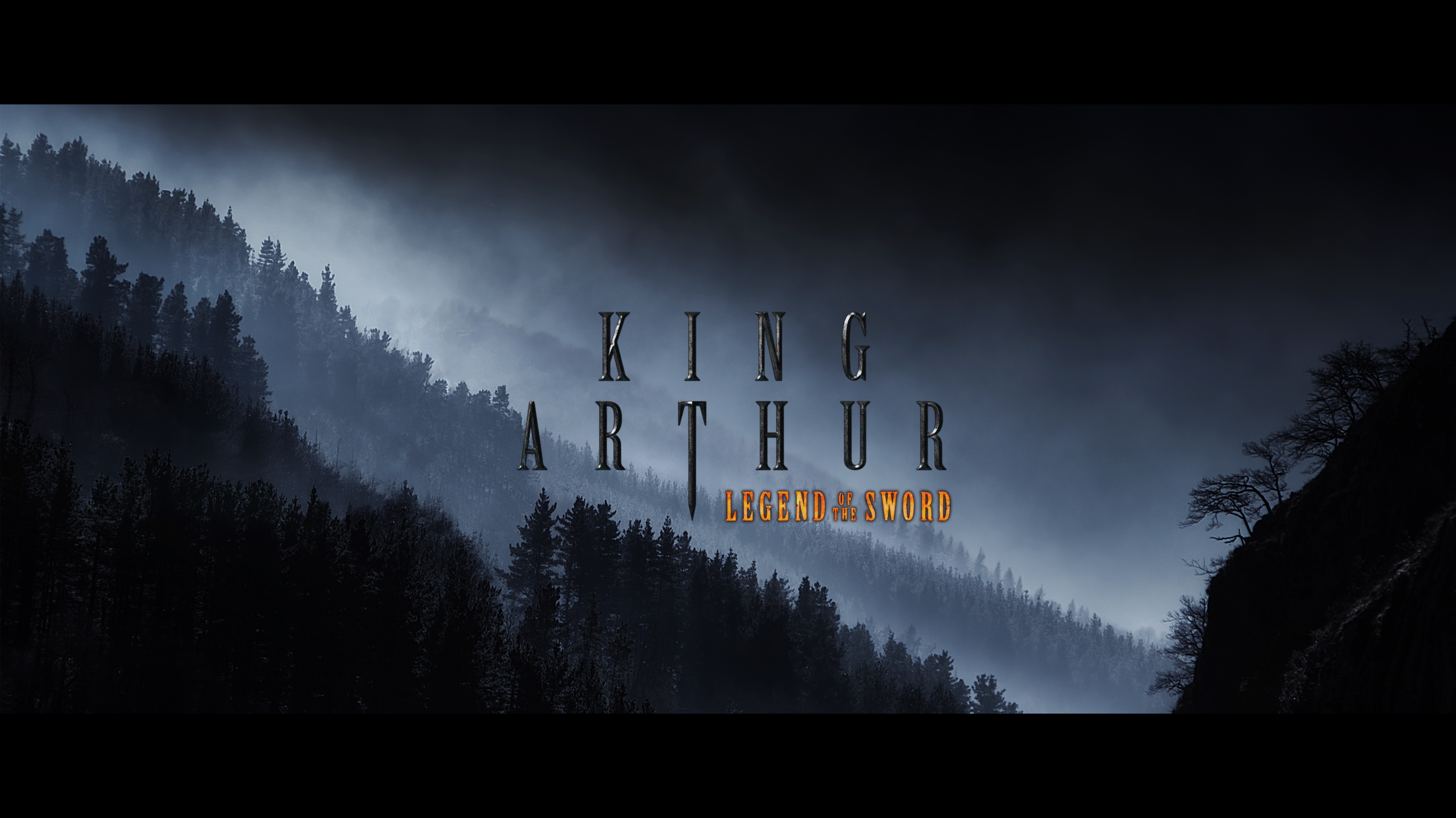
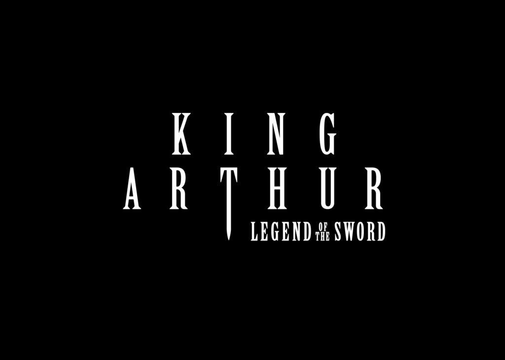
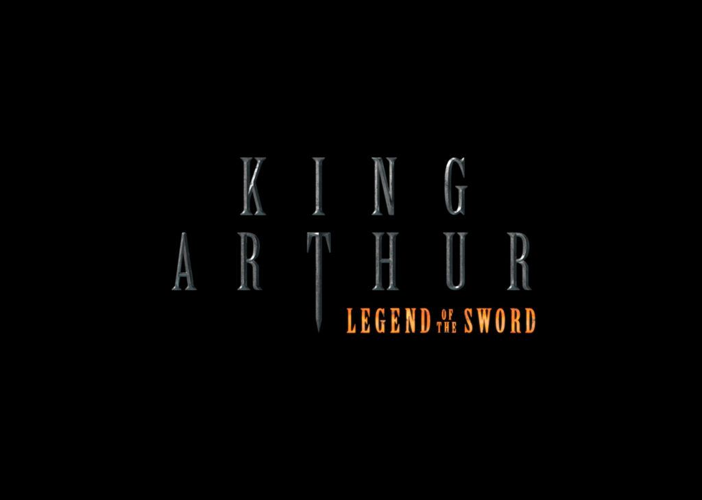
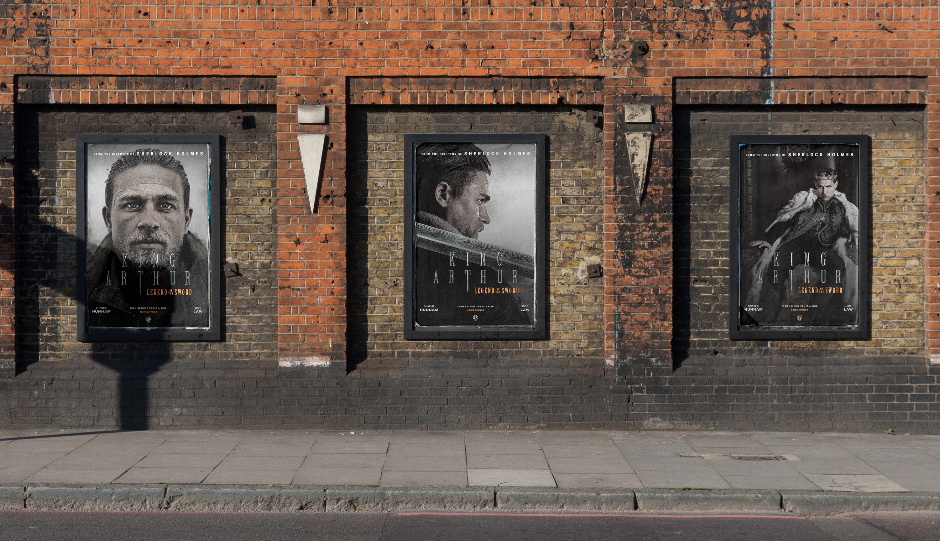
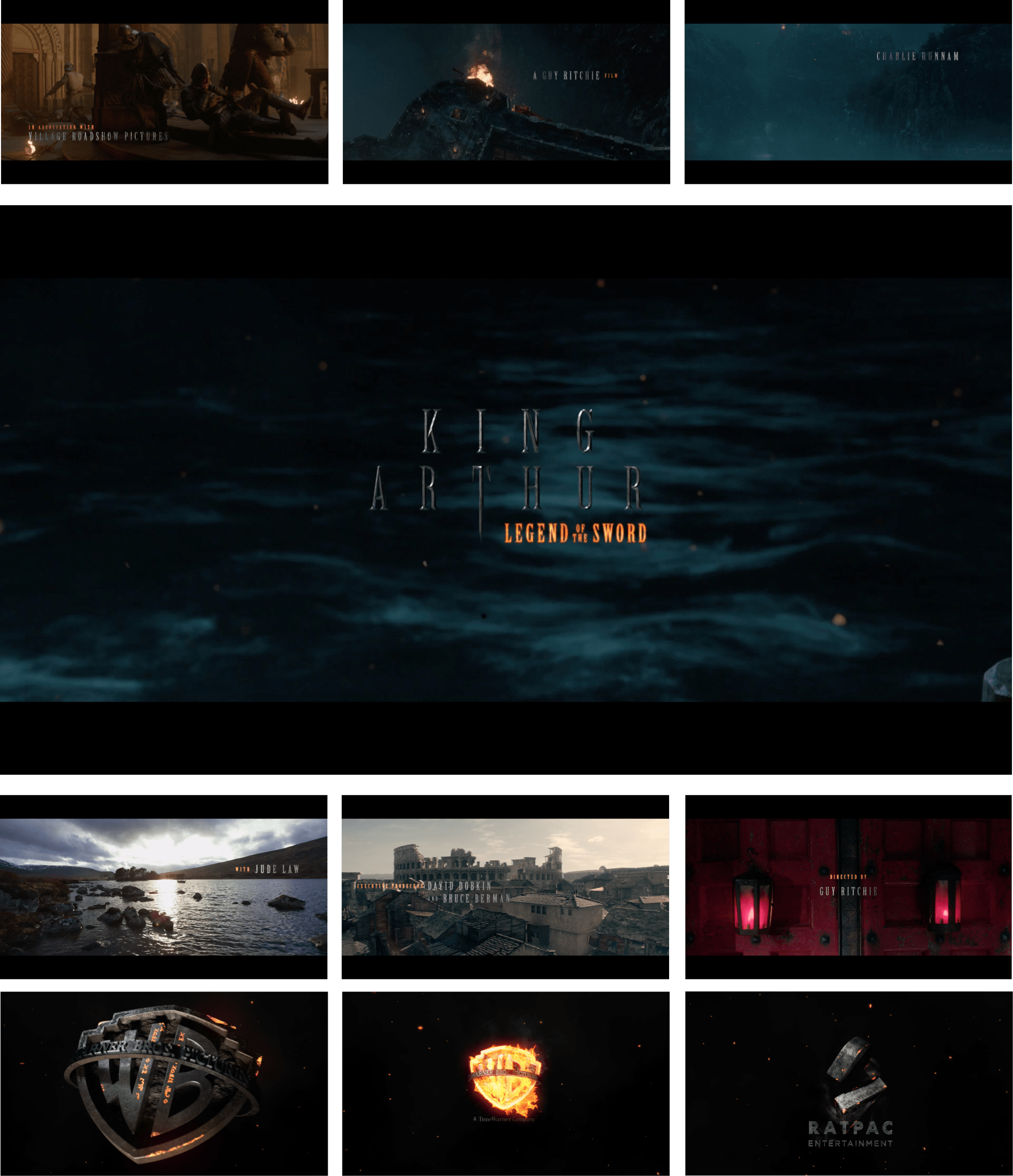
The concept was fairly straight forward, with the visuals playing on the forging of hot metals and the King Arthur logo itself was designed to incorporate the sword.
The visuals relied on heavy 3D and authentic texturing while fonts were ultimately crafted to fit into a highly restrictive framework.


